
Frida UX&UI Redesign (2022)
With The Gallardo Labs team we worked on the comprehensive website redesign of Frida Mom & Baby. As a central figure in the project, I played a crucial role in both UX and UI design, working towards enhancing user experiences and transforming the website into a more accessible and visually appealing platform. Our Collaborative & dynamic team, included key individuals: Nicole Gallardo (CEO), Sonia Acosta (Design Director), Nura Othman (UI Designer), Dayron Gallardo (Developer), and Deanna Woodall (Project Manager).
If you would like to see the responsive mobile design as well, please see the link below for the full redesign file.
Frida Redesign Figma File
Date
Nov 2021 - May 2022
Role
Client support & design on existing site, redesign of a new website as UX/UI Designer
Notable Tasks
Information Architecture, Design System, Accessibility Improvements, Client Support, Wireframes, and Visual Design
Accessibility
Contributors:
Deanna, Dayron
Objective
Elevate the website's accessibility and enhance it’s performance metrics to a passing score while educating stakeholders about accessibility best practices.
Process
Conducted a thorough audit of the website's accessibility, identifying areas for improvement.
Collaborated with the Project Manager to establish a prioritized action plan, streamlining our efforts.
Crafted descriptive alternative text for each image, ensuring screen reader compatibility and inclusivity.
Designed a comprehensive document that clearly communicated the required updates to the development team, fostering seamless implementation.
Updated the HTML hierarchy for better readability and search engine optimization.
Outcomes
Improved Accessibility: By addressing issues such as repeating alternative text, font contrast, and HTML hierarchy, we achieved a substantial leap in accessibility. Notably, the accessibility score surged from 64% to an impressive 93%.
Enhanced User Experience: Users with varying abilities could now navigate the platform effortlessly, contributing to a more inclusive digital ecosystem.
Educational Impact: Our efforts translated into a deeper understanding of accessibility best practices among stakeholders, nurturing a culture of accessibility-conscious design.
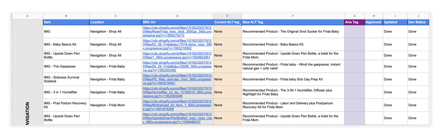
Collaborating with Deanna and Dayron, we recognized the significance of accessibility and undertook an audit to assess the current state of the website. This led to the creation of a priority list, guiding our efforts to enhance accessibility across the platform.
Navigation
Contributors:
Nicole, Sonia
Objective
Our aim was to simplify labels, establish intuitive categories, and revamp the search functionality. Our goal was to craft a seamless navigation experience that empowered users to effortlessly discover products and content.
Process
Inventory Audit: We meticulously audited the existing product inventory to identify redundancies and opportunities for consolidation. This analysis played a pivotal role in shaping our approach to category creation.
Competitive Analysis: To derive insights from industry best practices, we conducted a comprehensive competitive analysis. This helped us see what top brands were doing allowing us to uncover their strategies, serving as a foundation for our navigation redesign.
Card Sort: Collaborating with Nicole, we engaged in a thorough card sorting exercise. This facilitated the categorization of products in a manner that resonated intuitively with users, ensuring that the hierarchy of categories aligned seamlessly with their mental models.
Wireframes: Through an iterative process of wireframing, we visualized the newly envisioned navigation structure. This stage allowed us to fine-tune the user journey and establish clear pathways to relevant content.
Outcomes
Streamlined Categories: We developed a well-defined set of categories that seamlessly aligned with the diversity of FridaMom's product offerings. By carefully eliminating overlaps, we ensured that each category served a distinct purpose, optimizing user navigation.
Intuitive UI: The resultant navigation interface provided a clean and minimalist design that the Frida team loved. Our meticulous attention to visual hierarchy empowered users to explore the platform effortlessly, while an uncluttered aesthetic enhanced overall engagement.
Enhanced Accessibility: We reinforced accessibility by transforming top-level navigation into clickable elements. This alteration magnified the ease with which users accessed their desired destinations, catering to users of varying abilities.

Live Search
Contributors:
Dayron, Deanna
Objective
The goal was twofold: revolutionize the search experience by introducing real-time search capabilities and crafting a search results page that showcased relevant products efficiently. By creating a seamless pathway to desired content, or in some cases a pathway to content that was being promoted, we aimed to elevate usability, user satisfaction, and improve discoverability of promoted content.
Process
Inventory Audit & Information Architecture of Products: We created a logical hierarchy for products and information. This step laid the groundwork for a coherent search experience.
Competitive Analysis: Drawing insights from industry leaders, we extracted inspiration and applied best practices to infuse into our live search and search results page.
Collaboration with Developer Dayron: Part of the design was to fully grasp the technical capabilities and limitations of implementing a live search functionality. This provided the foundation of what was feasible for our specific live search. An example: with our timeline, we discovered that the live search could only be done when the user types a mininum of 3 characters.
Wireframes: We designed the live search interface and search results page
Outcomes
Empowering Exploration: The live search functionality empowered users to explore the platform effortlessly, allowing them to browse predictive suggestions and uncover relevant content while they typed.
Speed and Relevance: The introduction of real-time search vastly improved the speed of information retrieval. Moreover, displaying relevant products promptly further streamlined the user's journey.
Enhanced User Experience: The search results page was thoughtfully crafted to accommodate users' exploration needs, balancing visual appeal with efficient navigation.

Blog
Contributors:
Sonia, Nura
Objective
The overarching goal of this initiative was to alleviate cognitive strain on users, offering them a seamless journey through the wealth of content on motherhood. By facilitating swift topic filtering and enhancing the readability of existing blog posts, we aimed to curate an experience that resonated with users' preferences and priorities no matter what stage they were in.
Process
Research and Best Practices: We embarked on a comprehensive exploration of readability best practices and user preferences, delving into insights that resonate with readers. This research laid the groundwork for optimizing content consumption.
Strategic Editing: Leveraging existing blog posts as a blueprint, we meticulously edited the content to exemplify readability excellence. This entailed refining sentence structure, simplifying vocabulary, and implementing formatting techniques that enhance comprehension.
Template Creation: The edited blog posts were transformed into templates that could serve as a stylistic guide for future content. This ensured consistency in readability and visual appeal across all blog entries.
User-Centric Filters: Understanding the significance of topic-based filtration, we crafted an intuitive filtering system that empowers users to swiftly access articles relevant to their interests. This enhancement optimized content discovery and minimized cognitive load.
Outcome
Enhanced Readability: The concerted editing efforts materialized into content that resonates seamlessly with users. Clarity and conciseness in language combined with thoughtful formatting significantly enhanced readability.
Streamlined Content Discovery: The introduction of topic filters empowered users to tailor their content journey, pinpointing topics most relevant to their current interests. This feature minimized cognitive load by presenting users with content that resonates personally.
Seamless Content Transition: Navigating between related blog posts was made effortless, reinforcing engagement and nurturing a sense of continuity in content exploration.

Features & Specs on Product Page
Contributors:
Sonia, Nicole
Objective
This project's primary objective was to enhance users' experience and comprehension of the product. Our focus was on clarity and conciseness to empower users in making informed purchase decisions. We aspired to maintain honesty in our design, refraining from incorporating dark patterns, and instead allowing the product and reviews to speak for themselves.
Process
Comprehensive Inventory Specification Audit: Different from our initial audit, this phase enabled us to uncover shared attributes among products, facilitating efficient clustering and labeling.
Inspirational Competitive Analysis: Drawing insights from competitive analyses, we dissected varied approaches to product specification presentation. This exercise ignited a wellspring of ideas, significantly shaping our strategy for creating compelling and impactful specifications.
User-Centric Review Analysis: Immersing ourselves in user reviews yielded valuable insights into users' preferences and priorities. These insights, in turn, informed the restructuring of information hierarchy based on the aspects users typically seek first.
Research on E-commerce Standards: We delved deep into fundamental e-commerce standards to ensure a seamless and familiar user experience. This research endowed us with a profound understanding of user expectations and interaction conventions in the online shopping realm
Outcome
Interactive and Engaging Presentation: The reimagination of product specifications has culminated in an interactive and engaging display. Users can now explore features effortlessly, engaging with dynamic elements that enhance their understanding of the product.
Streamlined Hierarchy: The revamped structure meticulously guides users towards the most relevant information right from the outset. Users are intuitively directed to the details they seek, minimizing information overload and ensuring a focused browsing experience.
Aesthetic and Readable Design: The design overhaul embraces a clean and readable aesthetic, eliminating clutter and distractions. This design philosophy enhances content consumption and empowers users to glean insights efficiently.
Compact yet Comprehensive: The evolution towards a compact design doesn't compromise the comprehensiveness of information. Users can delve into nuanced details without feeling overwhelmed by excessive text or visuals.

See the Design File for the full work.
Thanks for reading!