
UX Solutions for WURRLYedu iOS app
Team: Lauren Alejo
Client: Wurrlyedu
Project type: Heuristic Evaluation to Medium-fi Wireframes

Hierarchal Navigation to a Flat Navigation
Before

With our user research we found that students are not enrolled in more than one music classroom, so selecting your classroom is a trivial step.
Although a hamburger menu can hold many pages on a page, it hides them. An intuitive navigation should always tell you where you are and all your other options from that page.
UX Solution for Navigation


Changing to a flat design allows users to view all features at the same time and switch between them easily.
We switched to a 5 item bar with the commonly used metronome as a constant button on the top left.
Modals and Feed
Before


The video proportions are too large to be all seen on one screen.
All actions besides the microphone (Record) are hidden within the view more options.
The create button confuses users because clicking it takes the user to the music catalog instead of creating a certain song.
Clicking on the ‘view more’ Button user is presented with a modal titled ‘privacy settings’ which include privacy settings and other features.
The opacity is and blur is too high for users to remember which screen they were on.
UX Solution for Modals and Feed

The video is automatically resized to fit the screen after user creates it, so user is able to view full video, Title and options to record, sing duet, delete or change view options.
Favorites songs which was found in the feed previously, is removed and moved to music catalog.
In order to get the user to focus on one task at a time, we have designed single question modals as iOS guidelines recommend.
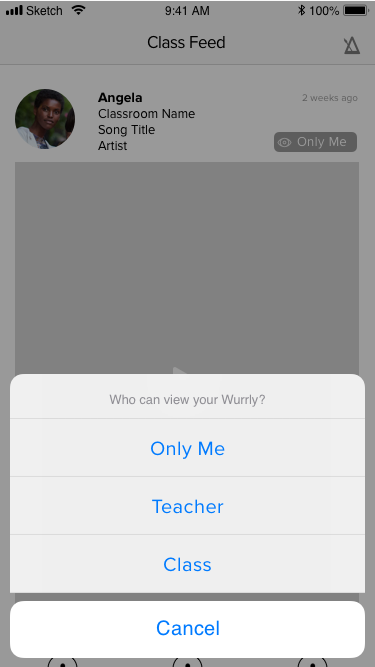

If a user clicks on ‘only me or their privacy setting they are able to change it.
We formed a clear question for the user “who can view your Wurrly?” instead of just stating “privacy settings.”
Opacity is lowered, but background is still visible if user needs to see the song.
Verbs for Actions, Title Case and Content Organization
Use verbs in titles. ‘An action-specific title shows that a button is interactive and says what happens when you tap it.’ - iOS Guidelines
Before

Using Verbs for Actions / Title Case
Using a verb to define an action. A user is actually browsing on this screen and a better verb to use would be ‘Browse’
To stay consistent we change the title of this page to ‘Music Catalog’
If you look at the circled objects, you will notice every thing is in Caps. Caps can often seem alarming, so in our new designs we have switched over to title case for more screens.
Simplifying the Music Catalog and Limiting the Number of Segmented Controls
‘Wider segments are easier to tap. On iPhone, a segmented control should have five or fewer segments.’ - iOS Guidelines
UX Solutions for Content


Instead of the AD like banner on top, we moved the blank track as the first item on the list.
We changed the title to match it’s function, ex: Create to Catalog, and Record or Create only for buttons that take you to the record screen.
Changing the text to title case creates friendlier interaction for the user.
Action Button Location Consistency
Before

In the first screen, we removed the create button which seems to follow us through every screen in the app.
Within Assignments the goal is to get the user to complete an assignment. The create button is a distraction because it removes the user from the assignments page into the music catalog.
Within the assignments the tab is removed and assignments is in fullscreen mode. In order for the user to complete the flow, the user can only go next or backwards.
Solutions for Action Button Location

Removal of the ‘Create’ button on the bottom.
Added a “due” before the date to specify exactly what the date means.


While the button on the bottom is more visible due to the color, the consistency of the top button through out the top creates more space.
Along with the action buttons being on top, we added a description to the back button to help the user navigate easily through the app.