UI Practice - Spotify Mobile Screens
I thought I was a great fit for this one job, but I didn’t get to move forward in the process. I asked for feedback and learned that they didn't see my UI skills matched what they were looking for. tear drop
That was hard, but I can understand it. There is much room for improvement. I have taken it upon myself to learn UI by recreating screens from apps that I love to use, then moving on to redesigning some. (suggestions here are so welcome!)
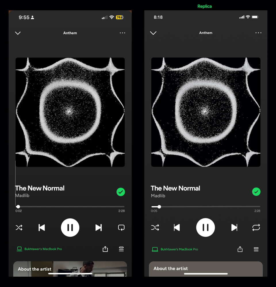
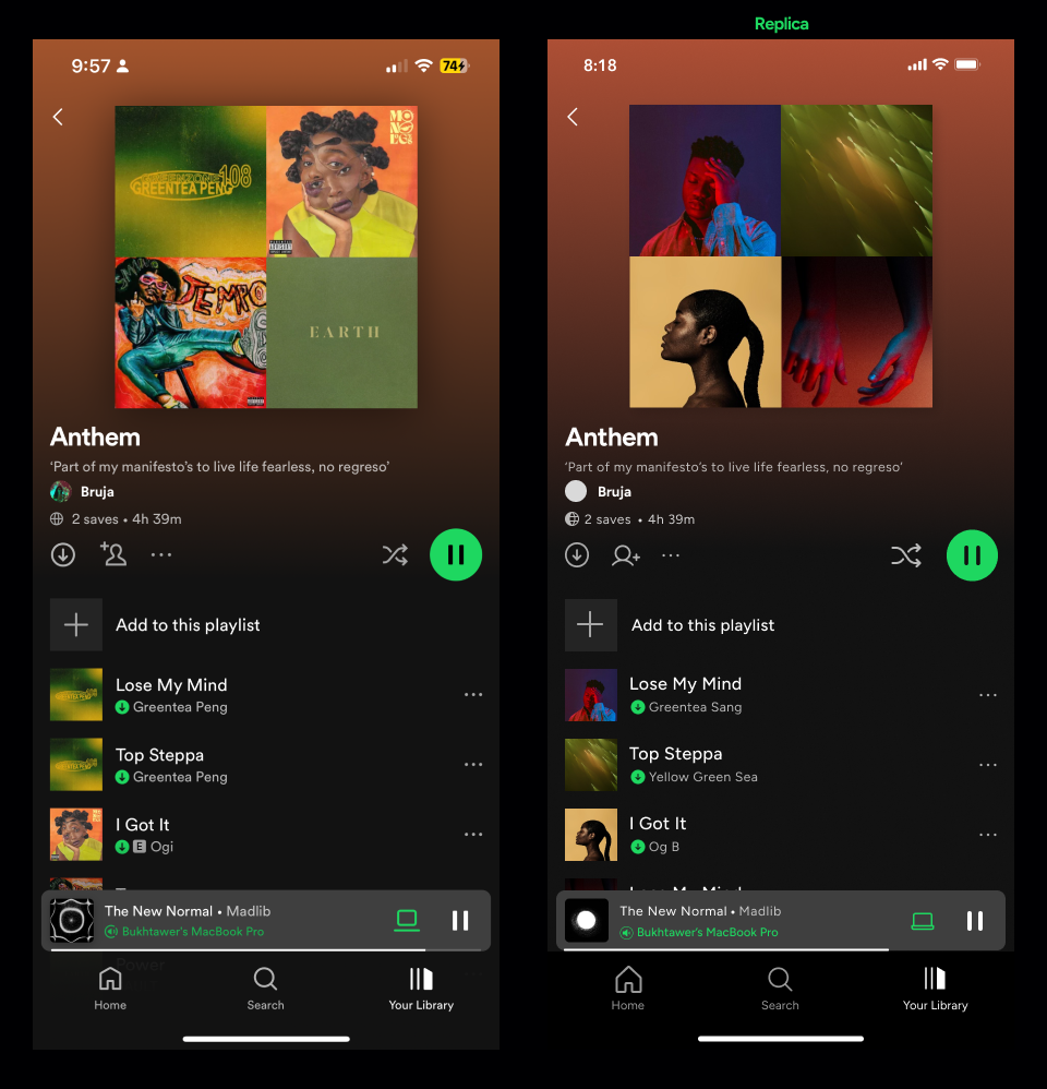
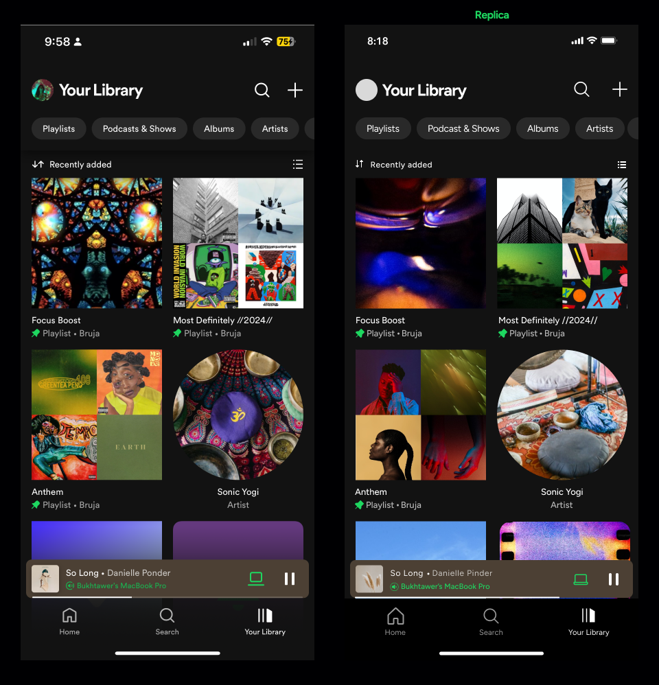
I started with Spotify, one of the apps I use most frequently on my phone.
Here are some of my observations.
Screens below.
Kerning!
For this project, I used Figtree, a typeface that's close enough to Spotify's 'Circular' Typeface. I think Spotify only uses Circular, but it looks so diverse and cohesive in their designs because they adjust the kerning for legibility and aesthetics. Take a look at the image with all the fonts I used to match it as closely as possible. Larger text appears more visually pleasing and readable when it is tightly spaced or over-kerned, while smaller text is spread out more.

Text Size
For accessibility reasons, the suggested smallest text size to use is 16pt. However, Spotify went down to 11pt for certain elements in the screens that I replicated. As a user, I don't mind at all, but I am just one person. As a designer, I wonder if this design excludes people. Thoughts?

Why not both? - Hierarchy
Size and colors are simultaneously used to establish hierarchy. Subtitles are notably smaller and more transparent. Yes, both at the same time, effectively guiding the user's attention to the most important elements. I may have used just one, but here I see how using both size and color is super effective.
For icons, I used sizes ranging from 80px all the way to 16px!
So XL, to XS. While creating the design system, I would create a table that includes all those sizes, but wouldnt require every icon to be those sizes.
A quick shoutout to the real MVPs here. The plugins (Phosphor Icons) and (Unsplash) for the images. Literally saved me hours.
(Share your fave plugins in the comments.)
Color
In terms of functional design, color is used sparingly.
As a UX designer, I was thinking about the times they used color. I can assume these are really important questions that the users are asking and need answers to right away.
'What speaker is the music playing on?'
'This song is downloaded'
'This playlist is playing'
Important to note that color was never used more than twice on a single screen for functionality.
——
Most of the variety in color is found in the background and album art.
The background color intrigues me. I am curious about the formula they use to create the gradient. It seems like an average of the colors from the album art, while maintaining accessibility. *insert heart-eyes here*
Margins
To understand their grid system, I heavily relied on rulers.
Generally, they utilize a 16pt margin on most screens, but they are not bound strictly to that system. Occasionally, they use the entire screen, and at other times, some cards are larger with an 8pt margin.
I really appreciate the flexibility this approach offers. It demonstrates that the UI designer prioritizes usability and visually pleasing design over rigid rules.
Alignment
I noticed alignment is based on the element itself, rather than the padding within which it is contained. For example, if you align text and an icon, in the past I would slect them and click align to the left… In these designs they align where the icon visably begins. I used rulers to align everything perfectly.
(Does this make it more difficult for developers?)
The 8pt Rule
Spotify is very consistent in using the 8pt rule to separate elements horizontally and vertically. Again, I noticed that often this was where the visible element started instead of counting the padding too.
Any numerologist enthusiasts out there? 2024 is the year of 8. Lucky lucky!!
——
What can I focus on next?